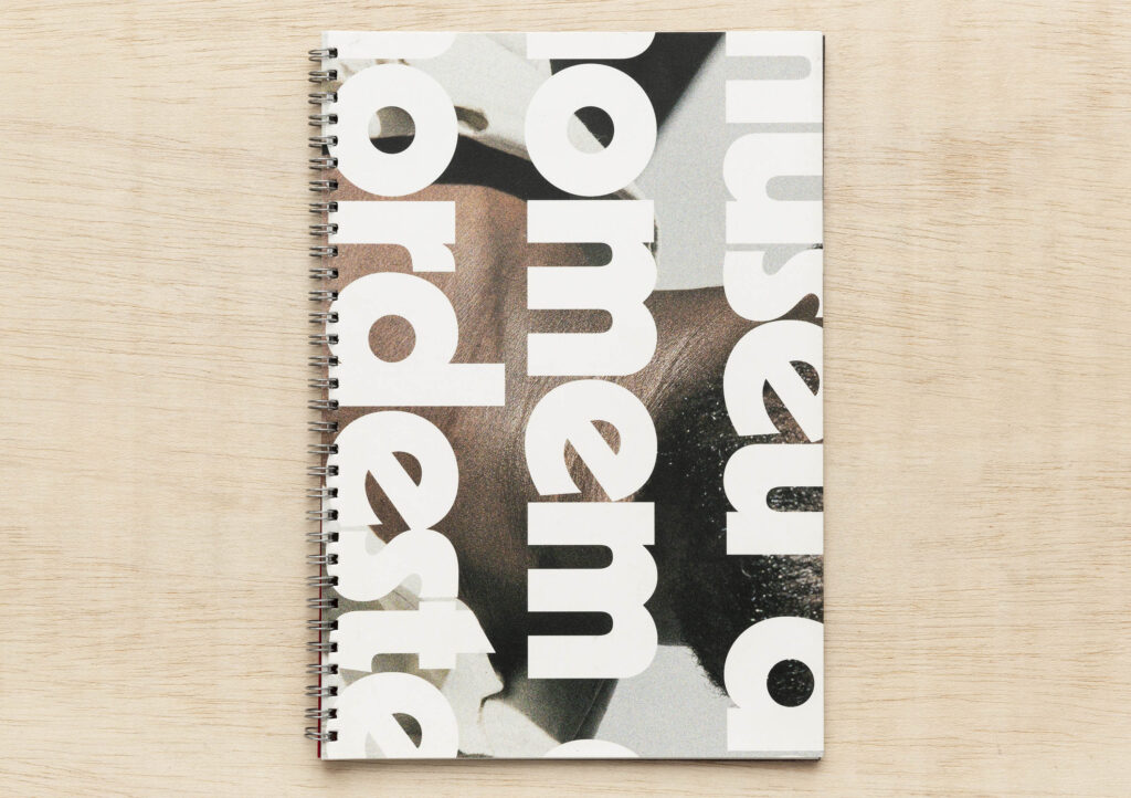
Stamp Out Democracy

stamp out democracy

Noreen Grahame
Stamp Out Democracy, 2012
Rubber-stamps on Kaskad Wheatear Yellow and Curious Translucent paper.
Machine bound with red cotton.
21.0 x 15.0 cm.
Signed and numbered.
Edition of 100.

Usados para endossar documentos oficiais, os humildes carimbos encarnam o poder. Por essa razão apenas foram empregados para fazer o livro Stamp out Democracy.
Um número mínimo de palavras ‘endossam’ a mensagem de que a democracia é sempre vulnerável. Como todos os perigos que começam pequenos e são ignorados, stamp outcresce em força a cada página até que democracy seja erradicada’.

stamp our democracy centre page

Used for official endorsements the humble rubber-stamp embodies power. For just that reason rubber-stamps are employed in Stamp out Democracy.

A minimum number of words ‘endorse’ the message that democracy is always vulnerable. Like all dangers that begin small and are ignored ‘stamp out’ grows in strength with each page until ‘democracy’ has been ‘stamped out’.
On the surface a light-hearted book commenting on the erosion of democratic rights. Below the surface, page by page, this light-heartedness is stamped out.

http://www.grahamegalleries.com.au/index.php/stamp-out-democracy

MzLk

E3P1-17

Brad Freeman
MuzeLink: The Tours
Purchase, New York: JAB Books, 1997
Offset
168 p.
11” x 8 1/2”
100 ex.

Processos  tradicionais e alternativos de pré-impressão, bem como imagens geradas por computador com base em fotografias, impresso em offset por Brad Freeman em cerca de dez cores. Duotones, tritones e separações de cores por toda parte. Costurado e encadernado pelo artista em uma edição de 100 exemplares.

Traditional and alternative graphic arts darkroom pre-press as well as computer generated photo based imagery offset printed by BF on LOE dull coated 100 lb. text, in around ten colors. Duotones, tritones and four color separations throughout. Case bound and hand sewn by the artist in an edition of 100.

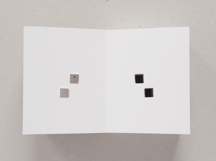
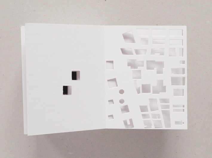
MuzeLink é uma história pessoal da impressão, começando com uma desconstrução lúdica do processo de impressão offset, em seguida, associando quatro reproduções a cores de cromolitografias do século 19 (o progenitor de litografia offset). Estas imagens fornecem uma visão sucinta dos valores sociais da época e lugar. Este é um livro complexo, que ressoa para trás e para a frente, fazendo referência ao livro como conceito e forma histórica, e o livro como meio para um artista.

MuzeLink is a personal / printing history starting with a playful deconstruction of the offset printing process then linking to four color reproductions of 19th century chromolithographs (the progenitor of offset lithography). These images provide a succinct view of the social values of that time and place. This is a complex book which resonates backward and forward, referencing the book as concept and historical form, and the book as an artist’s medium.

Nancy Princenthal escreve sobre MuzeLink:

“. . . não há nada esquemático sobre este livro. Apresentado com capas originais, feita de colagens a partir de folhas de ajuste com o título em prata e encadernado em seda Asahi, a festa visual de Freeman pode ser experienciada tão livremente como qualquer hipertexto. É servida, no entanto, com a compostura de alguém que conhece a sua história e vai satisfazer até quem lê-lo do início ao fim.
(From”On Paper”, novembro-dezembro 1997).

Nancy Princenthal writes of MuzeLink , “ . . . there is nothing schematic about this book. Presented in unique covers collaged from set-up sheets titled in silver, and bound in Asahi silk, Freeman’s visual feast can be sampled as freely as any hot-linked hypertext. It is served, however, with the composure of someone who knows his story will satisfy even those who read it from front to back.”
(From “On Paper”, Nov. – Dec. 1997)

(via http://www.bradfreemanbooks.com/)

Ink & Blood

E3P3-01

Abraham Cruzvillegas
Ink & Blood: 1968–2009
San Juan [Porto Rico], Trienal Poligráfica, 2009
serigrafia sobre papel
caixa de papelão, 23 x 32 x 5 cm
conjunto de 41 peças, dimensões variáveis

1_AC1391-29

It was in 1968 that Cruzvillegas was born, and this is furthermore the year of the oldest poster presented in the set Ink & Blood, 1968–2009. In this work, 41 posters and flyers created by social movements between 1968 and 2009 were reproduced in various formats on different kinds of paper, reflecting the diversity of their original contexts. Cruzvillegas based his work on extensive research into printmaking materials from around the world, used as a communication tool by groups related to social causes. This initial research gave rise to a collection of pieces related to Latin America, gathered in Ink & Blood, 1968–2009. For his work, the artist has chosen formats, slogans and languages that serve various agendas of the left – such as agrarian reform, the struggle for political freedom, and resistance to North American intervention (Cecília Rocha)

http://doobjetoparaomundo.org.br/artista/abraham-cruzvillegas/

nk & Blood can be seen as a non-official portrait of Latin America and as a monument to the resistance movements in the region from 1968 to 2009. It is also a tribute by Cruzvillegas, an artist recognised by the art world, to the often anonymous artists who designed the original posters and slogans. Considered as a kind of monument, it is significant that the work is neither solid in its materiality nor fixed in its configuration, as are most official monuments. Instead it is fragile and mobile. These material characteristics relate to the resistance groups themselves: their vulnerability, their temporary existence and their ability to adapt, change and manoeuvre to further their goals (via  http://www.tate.org.uk )

Salvar

Self Hipnosis

leandro-katz_self-hipnosis_1975_cover

Leandro Katz (Buenos Aires, Argentina, 1938)
Self Hipnosis
New York: Viper’s Tongue Books, TVRT Press, 1975
Pages: [18] p.
Dimensions: 25 x 20 cm.
Edition size: unknown

leandro-katz_self-hipnosis_1975_inside

On each page of this book one of eighteen identical photographs of a single billboard in Curacao advertising “Hipnotismo” is laid out next to a Mayan numeral and its Arabic counterpart. Beneath these visual pairings runs a text composed when the artist was back in New York under the influence of Severo Sarduy, Roland Barthes, Guy Debord, Charles Ludlam and especially Raoul Vaneigem.

“The photographs for this piece were taken in a period of thirty-six seconds during a trip to the island of Curacao, where Papiamento – a tropicalization of cold-weather languages – is spoken. There I read the work of Sylvanus G. Morley, whose obsession with the American past I swear made me scribble Mayan numerals in my sleep off the ground and into the night very possibly after a cabalistic formula to be used the next evening in the local roulette. […] ” (L.K.)

imagens: http://daskunstbuch.at
site do artista: http://www.leandrokatz.com/

One Man System

E1P6-07

Silvan Kälin, 1981- (Lucerne/ SUÍÇA)
One Man System
Ed. do autor
Recife, 2010
brochura; 15 x 21 cm

The found plastic figure of a simple, clownlike man serves as basic mold for reproduction.
I have named it One Man. Ignoring its original use or purpose, the mold of the figure is being used as universal matrix to reinvent and generate new products.
One Man is the form giving grinning face. Its potential iconographic possibilities are experimented in this project.

http://amarelo.ch/

one man system

Periferia

periferia

Caio Reisewitz (Caio Christian Reisewitz – São Paulo/SP, 1967)
Periferia
São Paulo: DBA; Galeria Brito Cimino; Grupo Takano, 2002
72 p.
Encadernado, capa dura
idioma: portugês/inglês
3.000 ex.
ISBN-13: 9788590265818

Notas: A realização deste livro foi possível a partir da Bolsa Estímulo recebida no II Premio Cultural Sergio Motta.

O livro de Caio Reisewitz é resultado da seleção de fotos feitas em mais de dois anos, através das quais procurou retratar algo de uma complexidade insofismável, a cidade de São Paulo. Na total ausência de texto, o título indica que se vai tentar empreender isso de modo alternativo já que, desde o primeiro momento, a cidade mal nos deixa detectar referenciais básicos como centro, história, o típico, ou representar-se, por exemplo, por seus habitantes.

Seus aspectos mais pitorescos são jogados contra uma massa monstruosa que, mesmo na bidimesionalidade do negativo fotográfico, permanece como um animal enorme, quieto, mas prestes a acordar e macular tudo com movimentos trágicos (uma poluição visual tão ostensiva que já se aceita como uma epiderme). Assim, poucos elementos contribuem para a consumação da proposta ousada do artista. O resultado, no entanto, não deixa de ser surpreendente, entre outras coisas, por atingir um tom de crônica sem palavras.

Levantando imagens com técnica virtuosística, de localidades inesperadamente bucólicas e toponímia tupi como o Pico do Jaraguá, à apropriação de anúncios de jornal com simulações gráficas de condomínios ainda não construídos, mas devidamente emporcalhados por estrangeirismos siderais e estranhamente de acordo  – Noblesse, Miami Gardens, Atuallité… -, acaba-se por se apresentar uma grande cena descontínua.

O sentido de crônica mantém-se porque os assuntos estão na ordem do dia, seja no boletim do telejornal ou na curtíssima florada do ipê pontuando um mês de setembro de terror no âmbito global. O recém desativado Carandiru, por exemplo, cuja entrada emblemática sentencia “Casa de Detenção”, é o pano de fundo da imagem em que um protagonista anacrônico veste roupa de marca, Cristian Dior, e sorri em pose de indiferença irritante. Outros assuntos estão implícitos, como as recentes tentativas de modificações  na lei de zoneamento a fim de desimpedir o empreendimento de condomínios verticalizados.

(…)

Em “Periferia”, tem-se um testemunho que, com o tempo, só tende a consagrar o risco da aposta em uma linguagem fragmentária para retratar o lugar onde se vive, em que a paisagem original em cor sépia ou verde “atlântico” e o rosa gritante dos classificados se apaziguam na locução sem palavras do incompreensível: ao pé da montanha, grupos se preparam para viver em um lugar que ainda não existe, mas que parece de uma sensualidade apavorante.

Rafael Vogt Maia Rosa, 2002

Museu do Homem do Nordeste


Título: Museu do Homem do Nordeste
Autor: Jonathas de Andrade
Editora: Mousse/Tijuana
Local de publicação: Berlim/São Paulo, 2013
édition bilingue (anglais / portugais)
19,2 x 28 cm (brochura, encadernação espiral)
50 p. (ill.)
ISBN: 978-989-98213-1-2

museu do homem1


museu do homem4

Conçue comme œuvre à part entière dans le cadre de la première exposition de l’artiste brésilien en Europe, cette publication rassemble une série de posters hypothétiques pour le « Museu do Homem do Nordeste » (le musée ethnographique fondé à Recife au Brésil par le sociologue et écrivain Gilberto Freyre dans les années 1970), une série de portraits d’hommes de la classe populaire de Recife démarchés dans la rue ou par petites annonces qui interroge la notion d’identité régionale / nationale.
 
Publié à l’occasion de l’exposition éponyme à la Kunsthalle Lissabon en 2013.
 

museus do homem3

L’œuvre de Jonathas de Andrade Souza (né en 1982 à Maceió, Brésil, vit et travaille à Recife) se fonde sur des recherches historiques, textuelles et photographiques. À partir d’un processus de documentation d’une précision quasi-anthropologique, l’artiste développe des installations conceptuelles qui mettent au jour l’amnésie culturelle frappant un certain nombre de réalités sociales, politiques, culturelles et idéologiques du monde contemporain.

http://www.lespressesdureel.com/

https://cargocollective.com/jonathasdeandrade/cartazes-para-o-museu

Absence

antenne.books.J. Meejin Yoon, Absence

Jeannie Meejin Yoon (Seoul, Korea, 1972)
Absence
New York: Printed Matter / The Whitney Museum of American Art, 2003.
12.5 x 10 cm.
[120] p.
2.000 ex.
ISBN 0894390139

Printed Matter’s Publishing Program for Emerging Artists

A book sculpture/artist’s book that is a memorial to the Twin Towers of the World Trade Center.

antenne.books.J. Meejin Yoon, Absence_2

“A solid white block of thick stock cardboard pages, the book’s ‘text’ consists of one pinhole and two identical squares die-cut into each of its one-hundred-and-twenty pages – one for each story of the towers including the antenna mast. These removed elements lead the reader floor by floor through the missing buildings towards the final page where the footprint of the entire site of the World Trade Center is die-cut into a delicate lattice of absent structures. The simplicity of Yoon’s materials and her use of repetition speak, without words, about unspeakable loss. At the same time, as a scale model of a vanished architectural site, it operates on a larger cultural level by commemorating the site itself.” — publisher’s statement.

antenne.books.J. Meejin Yoon, Absence_3

“J. Meejin Yoon is an architect, designer and educator. She is the founder of MY Studio, co-founder of Höweler + Yoon Architecture, LLP and an Associate Professor with tenure in the Department of Architecture at the Massachusetts Institute of Technology. Awarded the United States Artist Award in Architecture and Design in 2008, the Athena RISD Emerging Designer Award in 2008, Architecture Record’s Design Vanguard Award in 2007, the Architecture League’s Emerging Voices Award in 2007, and the Rome Prize in Design in 2005, Yoon’s work has been widely recognized for its innovative and interdisciplinary nature. Her design research investigates new intersections between space, technology and materiality.” – MIT Education Faculty website.

Fonte imagem: https://www.antennebooks.com/

Site da artista http://www.mystudio.us/

Salvar